The First Impression That Wins the Room
Picture this. You’ve just landed a meeting with a high-net-worth investor who manages a nine-figure portfolio. You walk in, hand over your business card, and before you say a single word, they glance at your logo. In that fraction of a second, they’ve already formed an opinion about your firm.
That’s not speculation. That’s how trust works at the top of the market.
In commercial real estate, where deals run into the tens of millions and clients have seen every pitch imaginable, your visual identity is a silent qualifier. A sharp, well-considered logo tells sophisticated clients you belong in the room. A generic one, with a clip-art building and a forgettable font, tells them you might not.
If you’re launching a new brokerage, rebranding after years of growth, or simply wondering why your current look isn’t attracting the caliber of clients you want, this guide is for you. We’re going to walk through the real psychology behind effective commercial real estate logo ideas, the specific design choices that signal authority, and practical concepts you can start using today.
Key Takeaways
- Your logo is a trust signal, high-value clients form judgments based on visual identity before any conversation begins.
- The most effective commercial real estate logos are built on four golden rules: simplicity, versatility, memorability, and scalability.
- Avoiding common design mistakes, like overcomplication and trend-chasing, is just as important as getting the right details in place.
- A great logo is the foundation of your entire brand strategy: from pitch decks to property signage to your digital presence.
Why Most Commercial Real Estate Logos Fall Short
Here’s what most CRE professionals get wrong: they treat their logo like a formality. Something to check off the list before the website goes live. The result? Thousands of commercial real estate companies sharing the same visual DNA, a stylized building silhouette, a navy-and-gray palette, a serif font that says nothing distinctive.
When everyone looks the same, no one stands out. And in a market where institutional investors are fielding pitches from dozens of qualified firms, the ones who look the part move to the top of the shortlist faster.
The deeper problem is that most CRE professionals don’t realize what a logo is actually supposed to do. It’s not decoration. It’s positioning. Your logo is the visual shorthand for everything your firm stands for, and it’s communicating that to every potential client who sees it, whether you’re in the room or not.
The 4 Golden Rules Every CRE Logo Must Follow
Before diving into specific commercial real estate logo ideas, it’s worth understanding the design principles that separate forgettable marks from ones that actually do business.
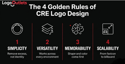
Rule 1: Simplicity.
Think of logos like Nike or Mastercard, simple, yet packed with identity. The key distinction here: minimalism should remove excess, not identity. A quick test, remove your brand name from your logo. Would people still recognize it? Would they remember it? If the answer is no, the mark isn’t doing its job on its own.
Rule 2: Versatility.
Logos now need to work across environments that didn’t even exist a decade ago, dark mode interfaces, animated digital formats, social media avatars, and app icons. Ask yourself: how will this logo look in motion? Can it adapt to both light and dark backgrounds without losing its impact?
Rule 3: Memorability.
People encounter hundreds, sometimes thousands, of logos every single day. The ones that stick are the ones that work as simple shapes first. Your brain remembers shapes and colors before it registers details. If your logo isn’t recognizable as a basic shape, no amount of detail or effects will save it.
Rule 4: Scalability.
Your logo isn’t just appearing on billboards. It lives on app icons, favicons, social media profiles, and email signatures. A practical rule: if your logo doesn’t work at 16 pixels, it’s too detailed. Design with multiple scales in mind, a full detailed version, a simplified icon, and color variations for dark and light backgrounds.
The Psychology Behind High-End CRE Branding
Before you develop specific commercial real estate company logos, you need to understand something most designers skip: your logo isn’t for you, and it isn’t for your client. It’s for your client’s client, the investor, the institutional buyer, the property partner who makes a snap judgment the first time they encounter your brand.
As one logo design framework puts it clearly: your audience should completely define your design choices. A luxury brand and a Gen Z fashion brand should not have the same logo style. In the same way, a high-net-worth investor-facing brokerage should not look like a residential agent who services first-time buyers.
Three psychological layers drive premium CRE branding decisions:
Shape psychology matters more than most people realize. Circles are friendly and approachable. Squares are reliable and structured. Triangles are dynamic and innovative. Slanted lines suggest motion, forward thinking, and energy. The trick is to match the shape language of your logo to the emotional expectations of the clients you’re trying to attract. Think of it like buying a gift for someone you know well, you don’t grab the first thing off the shelf. You think about what resonates with that specific person.
Color is your fastest positioning signal. Before anyone reads your firm name, they’ve already responded emotionally to your palette. A luxury brand aiming for exclusivity will use deep, rich tones. Deep navy and gold has become the benchmark in premium CRE for a reason, it signals stability and institutional credibility before a word is read. But the key principle is this: color choices should be driven by research into your audience, not by whatever palette is trending this quarter.
Typography reinforces personality. A high-end investment firm needs a logo that looks trustworthy, established, and professional, likely a classic serif typeface with deep blues or golds. A tech-forward commercial developer might need clean geometric sans-serif lettering that communicates precision and innovation. The typeface you choose should align with your audience’s expectations, remain legible across all sizes, and hold its character even when adjusted for weight and spacing.
CRE Logo Design at a Glance: What Works and What Doesn’t
| Design Element | What Works | Common Mistake | The Real Impact |
| Primary Font | Refined serif or geometric sans-serif matched to audience | Decorative, script, or trend fonts | Authority and professionalism, or the absence of it |
| Color Palette | Deep navy + gold, black + white + red, charcoal + ivory | Bright trend-driven palettes | Stability and premium positioning |
| Iconography | Geometric abstraction, shape-driven marks, lettermarks | Generic building clip art | Distinction and memorability |
| Logo Complexity | Clean, 2–3 element maximum | Too many shapes, gradients, effects | Confidence, or visual noise |
| Scalability | Multiple versions: full, icon, favicon | Single format that breaks at small sizes | Professional consistency at every touchpoint |
| Color Versatility | Works in grayscale and inverted | Relies entirely on color for recognition | Reliability across all print and digital formats |
“Design is not just what it looks like and feels like. Design is how it works.” — Steve Jobs
What Does the Research Actually Say?
Design isn’t just an aesthetic preference, it has real business consequences. According to research by the Design Management Institute, design-led companies outperformed the S&P 500 by 219% over a 10-year period.
For commercial real estate, this maps directly onto client acquisition. Your logo is often the first and fastest element of your brand a potential client encounters, on a website, a pitch deck, a listing, or a property sign. It needs to do meaningful work before a single conversation begins.
How Do You Know If Your Logo Is Actually Working?
There are three tests worth running on any CRE logo before you commit to it, or before you decide your current one needs replacing.
The blur test. Apply a blur filter to your logo. If the overall shape is still recognizable, you’re working with a strong foundational mark. If it falls apart completely, the logo is too dependent on fine detail. The Nike swoosh is still identifiable even blurred. That’s the level of shape strength to aim for.
The 5-second recall test. Show your logo to someone who represents your target client for five seconds, then put it away. Ask them to describe it, or even sketch it from memory. If they can’t, the logo isn’t memorable enough. This is one of the fastest and most honest feedback tools available, and most CRE professionals never use it.
The scalability test. Scale your logo down to favicon size, 16 pixels square. If it becomes an unrecognizable mess, you have two options: redesign the mark, or create a simplified icon version for small formats. Look at how Airbnb handles this, their full wordmark works beautifully on large formats, but at favicon size, they use a stripped-back symbol only. The English Premier League logo exists in at least four different formats for different contexts. This is how commercial real estate company logos need to be thought out in 2025.
Do This, Not That: The Most Common CRE Logo Mistakes
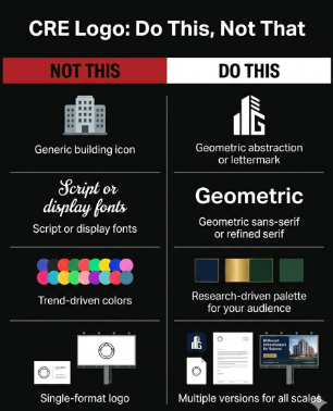
NOT THIS: Designing for trends. DO THIS: Let research drive every decision. Your color palette, typeface, and iconography should reflect your target audience’s values and expectations, not whatever is popular this season. Trends date you; principles don’t.
NOT THIS: Using a generic building silhouette. DO THIS: Commission a geometric abstraction or a crafted lettermark. The goal is something proprietary, a mark that couldn’t belong to any other firm in your market.
NOT THIS: Skipping the versatility tests. DO THIS: Before finalizing any logo, run it through the blur test, the 5-second recall test, and the scalability test. If it fails any of them, revise before it goes live.
NOT THIS: Treating your logo as a single static asset. DO THIS: Design a system, a full version, a simplified icon, and color variations for different backgrounds. This is how serious brands operate, and it’s the standard your clients will notice, even if they can’t articulate why.
A Familiar Scenario: When the Rebrand Changed Everything
Picture a mid-sized commercial brokerage, ten years in business, solid deal history, respected locally, but consistently passed over for institutional mandates. Their logo featured a blue globe, a generic font, and a tagline that said nothing memorable. It was built fast in the early days, and it showed.
After a focused rebrand, built around a geometric lettermark, a deep navy and white palette with red accents, a refined serif wordmark, and a properly scaled icon system, something shifted. Prospective institutional clients reviewing their updated pitch decks consistently used the word “established.” The work hadn’t changed. The perception had.
This isn’t a guaranteed formula. But it is a consistent pattern. When a commercial real estate firm’s visual identity aligns with the quality of work they actually deliver, it removes friction from every client conversation before it even begins.
Your CRE Logo Readiness Checklist
Before you sign off on a new logo, or decide your current one needs a refresh, run through this five-point check.
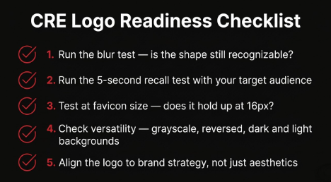
- Run the blur test. Apply a blur filter to your logo. If the core shape is still recognizable, you have a strong foundational mark. If it falls apart, the logo is over-reliant on detail.
- Run the 5-second recall test. Show the logo to someone who represents your ideal client for five seconds. Ask them to describe or sketch it. Honest and fast.
- Test at favicon size. Scale it down to 16 pixels. If it becomes unreadable, either simplify the mark or create a dedicated icon version for small formats.
- Check full versatility. Test in grayscale, inverted, on dark backgrounds, and on light backgrounds. A logo that breaks in any of these contexts isn’t ready.
- Align it to brand strategy. Your logo is one piece of a larger system. Before finalizing, confirm it connects to your positioning, your target audience, and the story you’re telling across your marketing and pitches.
The Bottom Line on Commercial Real Estate Logo Ideas
Your logo is not your brand. But it’s the front door of your brand, and in commercial real estate, first impressions aren’t just important. They’re often the deciding factor in who gets the call.
The firms winning the largest mandates and attracting institutional clients aren’t just better at the deal. They’re better at presenting themselves as the caliber of firm that belongs in those conversations. And that presentation starts with a logo that was built with intention, not assembled in a hurry.
The commercial real estate logo ideas that consistently work share one quality: every decision, font, color, shape, scale, is doing a specific job. And that job is to make the right person stop, look twice, and think: these people are serious.
If your current logo isn’t doing that, it may be time to take a hard look at what it’s actually communicating. At Logo Outlets, we build visual identities for commercial real estate firms that are ready to compete at the next level. Your logo should be the first place you start.
Frequently Asked Questions
What makes a good commercial real estate logo?
A strong CRE logo communicates authority and credibility at a glance. It’s built on simplicity, versatility, memorability, and scalability, with font, color, and iconography choices all driven by a clear understanding of the target audience. It should work in grayscale, at favicon size, and on every surface your brand appears on.
What are the best practices for testing a CRE logo before launch?
Run three tests: the blur test (is the shape still recognizable when blurred?), the 5-second recall test (can someone describe it from memory after five seconds?), and the scalability test (does it hold up at 16 pixels?). These three checks will surface most problems before you commit.
What are the top logo design trends in commercial real estate right now?
The clearest shift is toward restraint and systems thinking, fewer design elements, stronger foundational shapes, and logos designed in multiple formats for different contexts (full mark, simplified icon, dark/light variations). Premium firms are moving away from literal building iconography toward geometric abstractions and refined lettermarks.
How do I choose the right font and colors for my commercial real estate company logo?
Let your audience define the choices. A classic serif typeface with deep, rich tones communicates the trust and heritage that institutional investors expect. A geometric sans-serif with a bold, high-contrast palette fits firms targeting innovation-led commercial sectors. Color and typography should reflect the brand’s personality and audience, not what’s currently popular.
When should I hire a professional designer for my CRE logo?
If you’re targeting institutional clients, high-net-worth investors, or premium listings, from day one. The cost of an amateur logo in that market isn’t aesthetic. It’s credibility. Every time a serious prospect encounters a weak visual identity, it’s working against you before the conversation starts.
How much does professional commercial real estate logo design cost?
It varies considerably, from a few hundred dollars for freelance work to several thousand for a boutique branding studio with CRE expertise. What matters most is that the result performs strategically. A logo that costs $4,000 and positions you to win one institutional mandate has already paid for itself many times over.
Can Logo Outlets create a custom logo tailored to my commercial real estate firm?
Yes. Logo Outlets specializes in strategic visual identity design for CRE professionals, brokers, developers, investment firms, and brokerage founders. Every project starts with a deep understanding of your market positioning and target audience, so the final mark isn’t just well-designed, it’s built to compete.
What does Logo Outlets’ commercial real estate branding service include?
Logo Outlets delivers end-to-end brand identity for CRE firms, logo design, full brand identity systems, business card and letterhead design, pitch deck templates, signage mockups, and all digital-ready file formats. Every engagement is built around your specific positioning goals, not a generic template.
How do I know if my existing CRE logo needs to be replaced?
Ask this honestly: does your logo reflect the level of client you want to attract, or the level you were attracting five years ago? If prospects are regularly surprised by the quality of your work after seeing your brand, the gap is real. And if you’ve grown significantly since your original logo was designed, it’s almost certainly time for a refresh.
What’s the difference between a logo and a full brand identity system?
A logo is a single mark, the visual anchor. A brand identity system is everything that surrounds it: typography, color palette, iconography, messaging tone, and the rules governing how it all works together across every format and touchpoint. For CRE firms targeting premium clients, the full system is what creates consistent trust at scale, not just a single mark.