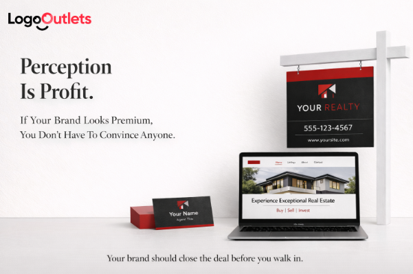
You’re walking into a listing appointment.
The homeowner has already looked you up.
They’ve seen your website header, your Instagram grid, your listing presentation cover, and your yard sign in the neighborhood.
Before you shake hands, they’ve made a call in their head:
“Feels premium.”
Or… “Feels like everyone else.”
That moment is why real estate company logo ideas matter more in 2026 than they did a few years ago.
Not because design trends changed.
Because buyer psychology didn’t.
People still use visuals as a shortcut to trust.
And in a crowded market, your logo becomes a filter.
It attracts the right clients.
Or quietly repels them.
Key Takeaways
- The best logo direction depends on your growth goal, not what looks “cool.”
- Brand consistency across every touchpoint builds recognition faster than novelty.
- Luxury branding requires alignment: visuals, messaging, presentation, and frequency.
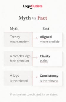
- A strong logo isn’t complex. It’s clear, scalable, and intentional.
Why This Matters Now
There’s an uncomfortable truth most agencies avoid.
You can be an exceptional operator and still lose high-value clients because your branding feels uncertain.
When your visual identity looks rushed, people assume the service is rushed too.
When your identity looks generic, people assume you’re interchangeable.
And if you’re planning a rebrand in 2026, this is the moment to do it strategically, not cosmetically.
A Direct Answer, Before We Go Deeper
A good real estate logo is a positioning tool.
It should communicate your market category, your level of service, and your confidence at a glance.
That’s the standard.
Everything else is decoration.
The Real Tension: Most Agencies Skip The Hard Questions
Most rebrands fail before design even begins. Not because of poor visuals, but because of unclear thinking. The strongest real estate company logo ideas are built on strategic clarity, not creative impulse.
Before you explore typography, colors, or symbols, you need to define what your agency actually stands for. What do you consistently represent in the market? What should it feel like to work with you? Calm and reassuring? Precise and polished? Bold and dominant? Branding is not just visual, it is emotional positioning.
You also need clarity about who you are trying to attract. Luxury sellers, investors, and first-time buyers respond to different signals. If your identity tries to appeal to everyone, it weakens its authority with all of them. Focus strengthens perception.
Then comes the harder question: what price point do you want to be known for? Your brand either supports that ambition or quietly undermines it. If you do not define your positioning intentionally, the market assigns one for you, and it usually defaults to average.
You do not need perfection. You need decisiveness. Once you are clear about who you are and who you are not, your logo becomes purposeful instead of decorative. And that is where a real rebrand begins.
The 4-Part Alignment Framework for 2026 Rebrands
Before you explore real estate company logo ideas, use this framework. Do not start with aesthetics. Start with alignment. A strong rebrand is not a design exercise. It is a positioning decision. This four-part structure ensures your logo reflects your strategy instead of masking confusion.
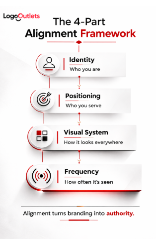
1) Identity
Identity defines who you are at the core. It clarifies your values, personality, and operating posture. Are you precise and polished? Warm and community-driven? Direct and assertive? Quietly confident and refined? Identity determines tone before visuals ever appear. Without this clarity, design becomes guesswork.
2) Positioning
Positioning defines the market space you intend to own. Luxury buyer representation is not branded the same way as investor-focused volume deals. Commercial brokerage does not look like boutique residential service. Trying to visually appeal to multiple categories at once usually results in dilution. When you attempt to look like both, you end up looking like neither.
3) Visual System
The logo is not the brand. It is one component of a broader system. If the logo appears on your folder, it should appear on your business card, your website header, your listing presentation, your signage, and every digital profile. Fonts, colors, spacing, and layout rules must remain consistent. Recognition compounds through repetition, not variation.
4) Frequency
Branding that is not seen regularly does not build memory. Visibility transforms identity into familiarity. Marketing output is what turns a well-designed logo into a recognizable presence. Without frequency, even strong branding fades into the background.
This framework prevents cosmetic rebranding. It forces alignment between who you are, where you compete, how you appear, and how often you show up. And that alignment is what makes a 2026 rebrand effective rather than temporary.
Real Estate Company Logo Ideas That Actually Match Positioning
Here are directions that work because they map to real business goals, not aesthetics alone.
1) Modern Monogram
Best for boutique agencies and luxury teams.
Visual cues:
- Initials as the primary mark
- Minimal geometry
- High contrast palette
- Quiet confidence
Common mistake:
Over-detailing the letters until it breaks at small sizes.
2) Minimal Wordmark
Best for growth-focused brokerages and modern firms.
Visual cues:
- Strong typography
- Intentional spacing
- Simple, scalable layout
Common mistake:
Choosing generic fonts with no custom refinement.
3) Elevated Emblem
Best for heritage positioning and high-trust service categories.
Visual cues:
- Balanced shapes
- Classic influence with modern restraint
- Badge-style structure
Common mistake:
Going too “old-world,” which can feel dated instead of established.
4) Architectural Mark
Best for commercial real estate logo ideas and urban markets.
Visual cues:
- Clean line work
- Subtle building geometry
- Strong horizontal layouts for signage
Common mistake:
Too much detail that becomes visual noise.
5) Abstract Property Symbol
Best for agencies that want a modern, tech-forward identity.
Visual cues:
- Simple abstract shapes
- Icon-first system for digital use
- Fast recognition
Common mistake:
Using stock-style icons that look templated.
A Practical Way To Choose The Right Direction
Here’s a simple checklist you can actually use.
- Decide the market you want to be known for.
- Pick one “brand feeling” you want clients to sense instantly.
- Choose a logo style that supports that feeling.
- Test it across: signage, mobile profile, website header, listing deck cover.
- Commit to consistency before you chase variations.
That’s how strong brands are built.
Mid-article reality check: which direction fits which agency?
| Logo Direction | When it helps most | A simple cue | Common mistake |
| Monogram | Premium positioning | Looks strong in one color | Too ornate to scale |
| Wordmark | Modern growth brands | Reads clearly at thumbnail size | Font feels generic |
| Emblem | Trust + heritage | Works well on print | Looks dated or heavy |
| Architectural mark | Commercial + city focus | Strong horizontal signage | Over-detailed skyline |
| Abstract symbol | Digital-first identity | App icon-ready | Stock-icon look |
What Most People Get Wrong About Rebranding
The biggest mistake is thinking the logo is the whole brand.
It isn’t.
A logo is a signal.
Your system is what proves it’s real.
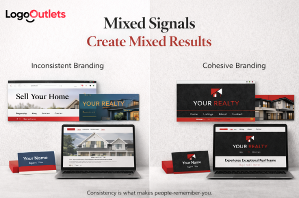
If your Instagram feels casual, your website feels outdated, your listing deck looks like a template, and your logo looks premium, people don’t trust the premium signal.
They trust the average of everything they see.
That’s why brand alignment matters.
And it’s why recognizable brands in real estate, like RE/MAX, Keller Williams Realty, Coldwell Banker, Compass, or Sotheby’s International Realty, feel consistent across touchpoints.
You don’t need their style.
You need their discipline.
A Familiar Scenario (Not A Case Study, Just Real Life)
An agency decides it wants to move into higher-end listings. The ambition is clear. The strategy, however, is incomplete. So they start with what feels easiest. They change the logo. They update the colors. They announce a “rebrand” on social media.
But everything else stays the same.
Their visuals remain inconsistent across platforms. Their Instagram feed still looks casual and unstructured. Their website layout feels dated. Their listing presentation hasn’t been refined. Their yard signs are unchanged. Their messaging continues to sound generic and interchangeable.
Six months later, they conclude that the rebrand “didn’t work.”
What actually happened is simpler.
They replaced the label but kept the same underlying experience.
A logo alone cannot elevate positioning. It can only signal it. If the client journey, communication style, marketing quality, and overall brand discipline do not rise with it, the market ignores the signal.
A rebrand succeeds when the client experience matches the visual promise. When perception and reality align, trust compounds. When they don’t, the market defaults back to its original judgment.
And that is why alignment matters more than aesthetics.
The Credibility Layer: Why Trust Signals Matter
In competitive markets, trust is not optional. It is the baseline requirement. Before clients evaluate your marketing plan, your negotiation skills, or your pricing strategy, they evaluate whether you appear credible. That credibility is shaped visually long before it is validated operationally.
There is a reason professional associations and industry standards exist. Organizations such as the National Association of Realtors, the Urban Land Institute, the Royal Institution of Chartered Surveyors, and the International Real Estate Federation reinforce structure, ethics, and professionalism within the industry. You do not need to reference them constantly in your branding. But your visual identity should reflect the same level of seriousness and discipline those institutions represent.
Professionalism is not communicated through slogans. It is communicated through consistency, clarity, and restraint.
One relevant market reality highlights the scale of the challenge. The National Association of Realtors reports over 1.6 million members.
Source: https://www.nar.realtor/research-and-statistics/quick-real-estate-statistics
That is a vast amount of competition. And visually, much of it blends together. Similar icons. Similar layouts. Similar color choices. Similar positioning language.
In that environment, a brand that feels intentional stands out faster. Not louder. Not more decorative. More deliberate. When your visual system communicates structure and confidence, it reinforces credibility before you ever speak. And in crowded markets, credibility accelerates trust.
Practical Steps To Execute A Real Rebrand (Without Chaos)
A rebrand only works when it is structured. Without a clear process, it becomes a scattered collection of visual changes instead of a strategic shift in perception. If you want your 2026 rebrand to move your agency forward rather than just refresh its appearance, follow a disciplined sequence.
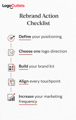
Step 1: Define positioning in one sentence
Write it clearly: “We are the go-to agency for ___ clients in ___ market.” If you cannot articulate your positioning simply, your logo cannot communicate it clearly. Precision in language creates precision in design.
Step 2: Pick one visual direction and commit
Not five variations. Not a mix of modern and traditional. Not “a little of everything.” Strong brands choose depth over variety. When you commit to a direction, consistency becomes easier and recognition compounds.
Step 3: Build a brand kit
A logo file alone is not a brand. You need defined logo variations, a disciplined color palette, typography rules, social templates, and signage layouts. This structure transforms design into a system. Systems create clarity. Clarity builds trust.
Step 4: Align every touchpoint
Your website header, listing presentation, business cards, yard signs, email signature, and social banners must feel like they belong to the same brand. When visuals are unified, perception strengthens. When they are inconsistent, confidence weakens.
Step 5: Increase marketing frequency
Not because you need to be louder. Because you need to be remembered. Recognition is built through repetition. Even the strongest branding fades without visibility.
Near the finish: what you should feel after reading this
After reviewing these principles, you should feel clearer. Not emotionally inspired. Not creatively overwhelmed. Equipped.
Because the strongest real estate company logo ideas are not random. They are strategic decisions tied to positioning, discipline, and consistency.
A 2026 rebrand is not about looking different for the sake of change. It is about looking aligned with the category you want to lead.
Conclusion
If you are preparing to rebrand for 2026, do not start by asking, “What looks good?”
Start by asking, “What do we want to be known for?”
That single question will guide your logo direction, your visual system, and your marketing consistency.
Real estate company logo ideas only become powerful when they are backed by alignment and repetition.
Your brand speaks before you do.
Make sure it is saying the right thing.
FAQ
1) What are good real estate company logo ideas?
The strongest real estate company logo ideas are rooted in positioning. A logo should reflect whether your agency operates in luxury, commercial, boutique, or high-volume markets. Beyond style, it must remain clear and readable across signage, mobile screens, listing presentations, and print materials. A good idea is not defined by trendiness. It is defined by alignment and scalability.
2) What are the latest real estate logo design trends?
Current real estate logo design trends often lean toward clean typography, minimalist monograms, and digital-first systems built for small-screen visibility. However, trends should never override positioning. A timeless and aligned identity will outperform a trendy but unfocused one. Strategic clarity matters more than aesthetic fashion.
3) What are the best colors for real estate logos?
Color choices should reinforce the perception you want to create. Neutral palettes such as charcoal, black, white, and muted metallic accents often signal trust, professionalism, and premium positioning. Bolder colors can work when aligned with a specific audience or market category, but consistency and restraint usually build stronger long-term recognition.
4) How to design a real estate company logo?
Start with positioning. Define your target client, your competitive category, and the price point you want to be associated with. Once that clarity exists, choose a logo direction that supports that perception and apply it consistently across every brand touchpoint. Design without strategic definition leads to decoration, not differentiation.
5) What makes a professional real estate logo?
A professional logo is clear, scalable, and consistent. It maintains legibility at large signage sizes and small mobile thumbnails. It integrates smoothly into a broader visual system, including your website, yard signs, listing presentations, and marketing materials. Professionalism is not complexity. It is clarity with discipline.
6) What are practical real estate branding tips for agencies?
Build one cohesive visual system and apply it everywhere. Define your typography, color palette, and layout structure, then maintain that consistency across digital and print assets. Increase marketing frequency so your brand becomes familiar in your market. Recognition compounds through repetition.
7) Why choose Logo Outlets for a rebrand?
Logo Outlets approaches rebranding strategically. We design strategy-first brand systems that align your logo, visuals, and messaging with your growth stage and positioning goals. The focus is not simply on creating a new look, but on strengthening perception and long-term brand equity.
8) Does Logo Outlets provide full brand identity beyond the logo?
Yes. In addition to logo design, we develop complete visual identity systems. This includes logo variations, typography guidelines, color palettes, and rollout-ready brand assets. The goal is consistency across every touchpoint so your rebrand translates into recognizable market presence.