You’ve probably experienced this moment: you pull up to a listing appointment, confident in your market knowledge, only to watch the client’s eyes drift to your business card… and pause.
Not impressed. Not excited. Just polite.
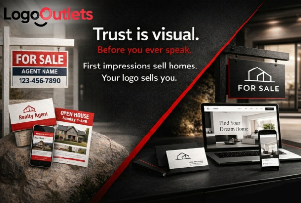
In real estate, perception is currency. Before clients hear your strategy, see your comps, or read your testimonials, they see your brand. And in 2026, a dated logo quietly signals something no agent wants associated with their name: out of touch.
The truth is simple. Modern real estate logo ideas are not about decoration. They are about trust signals. They communicate professionalism, positioning, and whether you belong in the same league as top performers like Ryan Serhant or Barbara Corcoran.
Key Takeaways
- A modern logo instantly signals credibility and premium positioning.
- Optical balance and custom typography separate professionals from amateurs.
- Strategic simplicity beats generic house icons every time.
- Your logo directly influences client trust, referrals, and listing conversions.
Why Your Logo Matters More Than Ever in 2026
Real estate has always been competitive. But in 2026, it’s compressed.
Today’s buyers and sellers compare agents the same way they compare properties: visually and quickly. They scroll profiles. They skim listing photos. They glance at branding before reading a single credential. Platforms like Zillow and Redfin have trained consumers to scan, judge, and decide in seconds.
You’ve probably done it yourself. You click through agents online and instinctively feel drawn to some while hesitating on others. That reaction often has less to do with years of experience and more to do with presentation.
Your logo appears everywhere:
- Listing presentations
- Yard signs
- Social media
- Email signatures
- Property brochures
- Digital listing portals
- For-sale sign riders
It becomes the visual shortcut for your reputation.
If it looks generic, cluttered, or outdated, it quietly undermines your authority before you even speak. Not dramatically. Not obviously. Just subtly enough to create doubt.
And doubt is expensive.
When a homeowner is deciding who should represent one of their largest financial assets, they look for signals of confidence and stability. A refined brand suggests organization, attention to detail, and professionalism. A sloppy one suggests the opposite.
Major brokerages understand this deeply. Brands like Keller Williams Realty and RE/MAX maintain strict visual standards because consistency builds trust at scale. Independent agents don’t have a national brand carrying that weight. Your logo carries it for you.
In 2026, your brand is not separate from your expertise. It is part of how your expertise is perceived.
What Makes a Real Estate Logo Look Modern?
A modern real estate logo combines clarity, optical balance, and brand personality. It avoids clichés and communicates confidence through simplicity.
But modern does not mean trendy.
It doesn’t mean copying what feels popular this month. It means designing something that feels current, intentional, and durable. Something that works just as well on a luxury listing presentation as it does on a mobile screen thumbnail.
Modern real estate branding ideas share a few consistent qualities:
- Minimal, purposeful elements
- Strong, readable typography
- Thoughtful use of contrast
- Clean spacing and visual breathing room
- Avoidance of overused house icons and decorative clutter
Simplicity is not laziness. It is restraint. And restraint signals confidence.
When a logo is overloaded with gradients, shadows, or excessive detail, it can feel like it’s trying too hard. A modern logo feels composed. Calm. Certain.
That certainty transfers to you.
The 2026 Definition of a Modern Logo
A modern logo is optically balanced, strategically simple, and uniquely branded, designed to remain clear and trustworthy across digital and physical formats.
Optically balanced means it looks right to the human eye, not just mathematically perfect. The weight feels evenly distributed. The spacing feels intentional. Nothing looks slightly “off.”
Strategically simple means every element serves a purpose. Remove something unnecessary, and the design becomes weaker, not cleaner. Add something unnecessary, and it becomes cluttered.
Uniquely branded means it reflects your positioning. A luxury-focused agent should not look identical to a high-volume, entry-level specialist. Your typography, spacing, and color choices should align with the market you want to dominate.
And most importantly, it must work everywhere:
- On signage across a busy street
- On a business card across a conference table
- On a smartphone screen in a social feed
- On digital ads and property portals
If it only looks good in one context, it isn’t modern. It’s incomplete.
The Hidden Psychology Behind Logos That Build Trust
Great logos work because they align with how the brain processes shapes, balance, and contrast.
The human eye constantly searches for order. When shapes feel balanced and proportioned, we experience visual comfort. When they feel slightly uneven or misaligned, we experience subtle tension, even if we can’t explain why.
That tension influences perception.
Logos that build trust reduce visual friction. They feel harmonious. Structured. Intentional.
This isn’t about artistic preference. It’s about perception mechanics.
Optical Balance Over Mathematical Perfection
Designers often start with perfect geometric shapes. Perfect circles. Perfect squares. Perfect symmetry.
But perfectly symmetrical shapes can look wrong to the human eye due to optical illusions like the Poggendorff effect. When thin lines intersect thicker ones, the brain can overcompensate, making elements appear misaligned even when they are mathematically identical.
That’s why strict symmetry does not always equal visual harmony.
What this means for your logo:
- Lines must be optically aligned, not mathematically identical.
- Rounded edges should be subtly adjusted for natural flow.
- Visual balance matters more than perfect geometry.
If a rounded shape connects to a straight edge, it often needs slight adjustment to prevent it from appearing pinched or bowed. If a vertical line intersects a heavier horizontal stroke, its placement may need refinement to feel centered.
These refinements are subtle, but powerful.
This is why major brands refine shapes manually rather than relying on perfect circles and squares. The difference is rarely dramatic. It’s precise. And that precision is what separates professional real estate logo ideas from generic templates.
When a logo feels optically balanced, it communicates something deeper: attention to detail.
And in real estate, attention to detail builds trust.
The 5-Part Framework for Modern Real Estate Logo Ideas
If you strip away trends, software tools, and design buzzwords, modern real estate logo ideas follow a clear structure. They aren’t random. They aren’t decorative. They’re engineered.
Think of this as your positioning framework. If your logo aligns with these five principles, it will feel intentional. If it doesn’t, something will always feel slightly off.
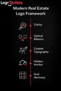
1. Clarity Over Complexity
Simple logos scale better across signs, mobile screens, and social media.
In real estate, your branding must function in wildly different environments. A yard sign viewed from across the street. A tiny circular profile image on a listing portal. A polished presentation cover sitting across a conference table.
Clarity wins in all three.
Do this:
- Clean lines
- Minimal elements
- Strong spacing
- Clear hierarchy between icon and name
Not that:
- Cluttered icons
- Heavy gradients
- Drop shadows
- Overly detailed illustrations
When a design tries to say too much, it says nothing clearly. The strongest professional real estate logo ideas communicate one thing well: confidence.
If your logo requires explanation, it’s too complicated.
2. Optical Balance (Not Perfect Geometry)
Perfect shapes can look uneven. Subtle adjustments create harmony.
This is where many well-meaning designs fall apart. A perfectly centered icon can feel slightly left-heavy. A mathematically aligned wordmark can look misaligned to the eye.
What most people get wrong:
They assume symmetry equals balance. It doesn’t.
Balance is about visual weight. If one side feels heavier, even slightly, the entire logo feels unstable. And instability, even at a subconscious level, weakens trust.
Modern real estate logo design requires refinement:
- Adjusting spacing between letters
- Tweaking curves where straight lines meet rounded forms
- Slightly shifting elements to achieve optical alignment
These micro-adjustments separate custom work from templates. And clients can feel the difference, even if they can’t articulate it.
3. Custom Typography Signals Authority
Custom letterforms create memorability and exclusivity.
Typography is not just text, it’s tone.
A default font pulled straight from a design library immediately signals “standard.” It’s not wrong. It’s just forgettable.
Agents with bespoke or refined typography appear more established than those using generic fonts. Even subtle modifications, adjusted letter spacing, customized terminals, unique ligatures, create distinction.
Consider how recognizable brokerage names become over time. Strong typographic identity reinforces authority. For an independent agent, your name is your brand. The way it’s styled should reflect that.
Modern realtor logo ideas increasingly lean toward:
- Strong wordmarks
- Refined monograms
- Clean geometric sans-serif or elegant serif combinations
Typography alone can make a brand feel luxury, approachable, bold, or corporate. Used intentionally, it becomes your competitive edge.
4. The Hidden Anchor Principle
A darker or desaturated element stabilizes colorful designs.
Many logos fail because every element competes at the same intensity level. Bright icon. Bright text. Bright accent. Nothing grounds the composition.
The hidden anchor principle solves this.
A darker or more neutral tone creates visual stability. It “trains” the eye where to rest. Without it, the logo feels floaty and unanchored.
Example:
A dark wordmark anchoring a vibrant icon keeps the logo grounded and readable.
This is especially important in modern real estate branding ideas where color is used strategically. Even if your palette includes red, gold, or blue accents, there should be a stabilizing tone, charcoal, deep navy, black, that gives structure.
It’s subtle. But powerful.
5. Grid Harmony
Using a grid ensures your logo scales and aligns across platforms, from signage to mobile.
Grids are invisible, but they create cohesion.
When a logo is constructed within a grid system, proportions remain consistent. Spacing feels deliberate. Alignment holds together whether the logo is printed large or scaled down.
Grid harmony ensures:
- The icon and wordmark align cleanly
- Spacing between elements remains consistent
- The design doesn’t distort when resized
Without structure, logos often drift. Slight misalignments become exaggerated at different scales. Over time, inconsistencies chip away at credibility.
Professional real estate logo ideas aren’t improvised. They’re structured.
Practical Checklist: How to Design a Modern Real Estate Logo
You don’t need to redesign everything overnight. But you can evaluate your current logo through this lens.
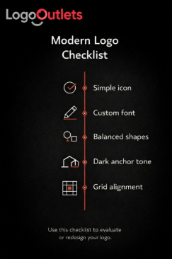
5 Steps You Can Apply Today
- Remove unnecessary elements and simplify your icon.
If you remove something and the design improves, it didn’t belong there. - Adjust shapes visually rather than relying on perfect geometry.
Trust your eye. Small refinements make a large difference. - Customize typography to create uniqueness.
Even slight modifications make your name feel intentional instead of generic. - Add a darker tone to anchor the design.
Stabilize bright elements with a grounding color. - Align elements using a grid for consistency.
Check spacing, proportions, and symmetry at multiple sizes.
Run your current logo through this checklist.
If it passes confidently, you’re positioned well.
If it hesitates at multiple points, you’ve likely found your opportunity to upgrade.
Because modern real estate logo ideas aren’t about looking trendy. They’re about looking established.
Mid-Article Comparison Table: Modern vs Outdated Logos
| Feature | Modern Logo Approach | Outdated Approach | Impact on Clients |
| Icon style | Minimal or abstract | Literal house clipart | Feels generic |
| Typography | Custom or refined | Default fonts | Signals amateur |
| Color usage | Strategic contrast | Random bright colors | Looks unprofessional |
| Shape balance | Optically adjusted | Perfect geometry | Appears “off” |
| Scalability | Works on mobile & signage | Blurs when resized | Hurts credibility |
Mistakes That Make Agents Look Outdated
Most outdated branding isn’t the result of laziness. It’s the result of assumptions. Design trends shift. Buyer expectations evolve. Digital platforms compress attention spans. But many logos remain frozen in the year they were created. The issue isn’t that they’re terrible. It’s that they quietly signal,
“I haven’t evolved.”
And in a market where positioning matters, that signal works against you. Let’s clear up a few common misconceptions that continue to hold agents back.
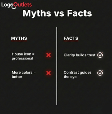
Common Misconceptions
Myth: A house icon is required.
Reality: Abstract marks often feel more premium.
The real estate industry is saturated with rooftops, chimneys, and window outlines. When every other agent uses a literal house symbol, it stops communicating uniqueness. It blends.
Modern real estate logo ideas often lean toward abstraction, monograms, geometric marks, refined wordmarks. These feel less predictable and more elevated. They suggest brand identity, not industry cliché.
When something feels overused, it rarely feels premium.
Myth: More colors make a logo stand out.
Reality: Strategic contrast guides attention better.
Color can attract attention, but too much of it creates noise.
A logo with five competing bright colors may technically stand out, but it won’t feel composed. High-end brands understand restraint. One dominant tone. One anchor. One accent.
Contrast directs the eye. It creates hierarchy. It tells viewers where to focus first.
Standing out is not the same as shouting. In professional real estate branding, clarity beats chaos every time.
Myth: Fancy fonts look luxurious.
Reality: Clean typography communicates confidence.
Decorative script fonts and ornate letterforms are often mistaken for elegance. In practice, they frequently feel dated or overly dramatic.
Luxury in 2026 leans toward refinement, not ornamentation.
Clean typography, whether a well-balanced serif or a strong sans-serif, signals control. It’s readable at a distance. It scales on digital screens. It feels deliberate.
When typography is hard to read or overly stylized, it subtly suggests inexperience. When it’s crisp and intentional, it suggests authority.
A Familiar Scenario: The Rebrand That Changes Perception
Imagine two agents working in the same neighborhood.
Agent A uses a logo designed years ago. It features a literal house icon, bright gradients, and a decorative font. It’s not offensive, but it feels busy.
Agent B adopts a modern, balanced mark with custom typography and neutral tones. The design is simple. Structured. Confident.
Within months:
- The modern brand appears more frequently in higher-value listings.
- Clients describe the agent as “established” and “professional.”
- Referral conversations include phrases like “They look like they handle luxury properties.”
- Listing presentations feel smoother because the materials match the message.
Nothing about their negotiation skills changed. Nothing about their market knowledge improved overnight.
Only the perception did. And perception influences opportunity.
This is what many agents underestimate: branding doesn’t replace competence, it amplifies it. If your expertise has grown but your visual identity hasn’t, there’s a disconnect.
Modern real estate logo ideas aren’t about chasing aesthetics. They’re about aligning how you look with how you operate. When that alignment clicks, clients feel it.
And when clients feel confident, they choose confidently.
How Branding Influences Referrals and Listings
Clients don’t just hire skill, they hire certainty. When a homeowner chooses an agent, they’re deciding who feels capable of representing one of their largest financial assets. A polished brand builds that confidence before a single contract is signed.
A clean, consistent logo across listing presentations, yard signs, email signatures, and social media signals structure and professionalism. And clients naturally assume that if you’re meticulous with your brand, you’ll be meticulous with their transaction.
Major brokerages like Keller Williams Realty and RE/MAX maintain strict brand standards because consistency builds trust. Independent agents can create the same effect through a strong personal identity.
Your logo becomes your anchor across every touchpoint. If it feels intentional and modern, your business feels established. If it feels outdated, it introduces hesitation.
Strong branding reduces doubt. And when doubt disappears, clients decide faster, and refer more confidently.
Conclusion
Your logo is not a decorative piece. It is your silent introduction, your trust signal, and your positioning tool. Long before you speak about strategy, market data, or negotiation skills, your branding has already communicated something about you.
Modern real estate logo ideas focus on clarity, optical balance, custom typography, and strategic simplicity. When executed well, they elevate perception. They align your visual presence with the level of professionalism you bring to every listing. They help you appear positioned alongside top-performing agents in your market.
In competitive environments, credibility is often visual before it is verbal. If your branding feels dated, cluttered, or forgettable, it may be time to refine it. Not because trends demand change, but because your growth deserves to be visible.
The agents who look credible are often the ones clients call first. Make sure your logo supports the reputation you’ve worked to build.
FAQ
- What makes a good real estate logo?
A good real estate logo is simple, optically balanced, and memorable. It should scale clearly across signage and digital platforms while reflecting your personality and market positioning. - What are the best practices for modern real estate branding?
Modern branding relies on minimal design, refined typography, strong contrast, and consistent alignment. These elements create a cohesive and professional appearance across every client touchpoint. - What trends define modern real estate logo ideas in 2026?
Current trends favor abstract marks, controlled color palettes, customized typography, and simplified shapes. The emphasis is on clarity and long-term relevance rather than decorative details. - How to design a modern real estate logo?
Begin with a clear concept. Simplify your design, refine shapes for optical balance, customize typography, and test the logo at multiple sizes to ensure it remains readable and consistent. - When to hire a professional logo designer?
Consider hiring a professional when your brand feels misaligned with your current level of expertise, when targeting higher-value listings, or when consistency across digital and print platforms becomes essential. - What services do real estate branding agencies provide?
Branding agencies typically offer logo design, full brand identity systems, typography refinement, color strategy, marketing templates, and brand guidelines to maintain consistency. - How much does a custom real estate logo cost in the USA?
Costs vary depending on scope and experience level. Freelance logo projects may start in the hundreds, while comprehensive brand identity packages can reach several thousand dollars. - What defines a professional real estate logo?
A professional logo prioritizes clarity, balance, scalability, and uniqueness. It avoids unnecessary decorative elements and communicates confidence through simplicity. - Best modern real estate logo ideas for new agents?
Clean monograms, strong wordmarks, and minimal abstract symbols help new agents establish credibility quickly without relying on overused clichés. - Why should I choose Logo Outlets for logo design?
Logo Outlets focuses on strategic branding for real estate professionals, ensuring your logo communicates trust, authority, and market relevance from the very first impression.